Case Study
Ever Skincare
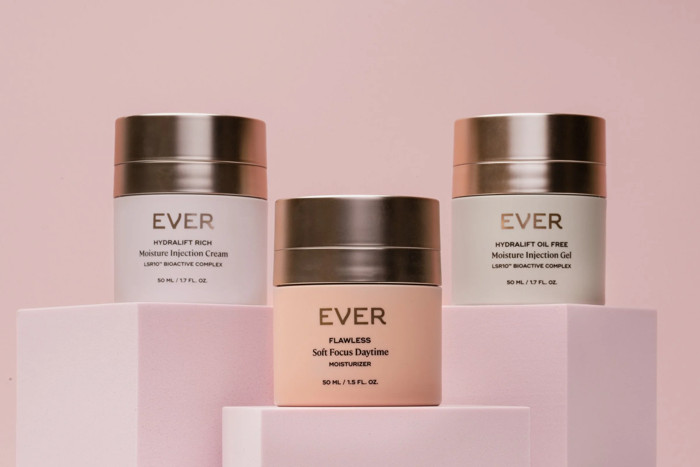
After rebranding and a packaging redesign—where each product stage was color-coded—Ever Skincare needed a cohesive photography guideline to maintain brand consistency across all future content.
The Ask
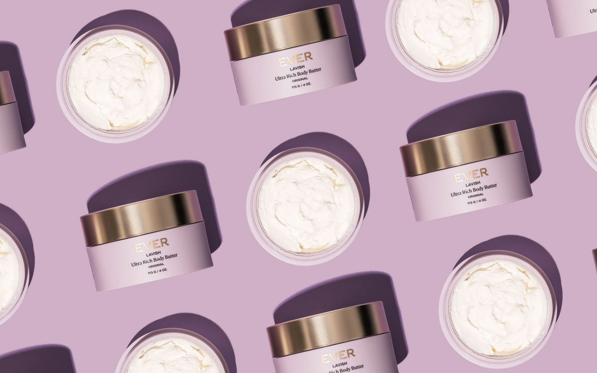
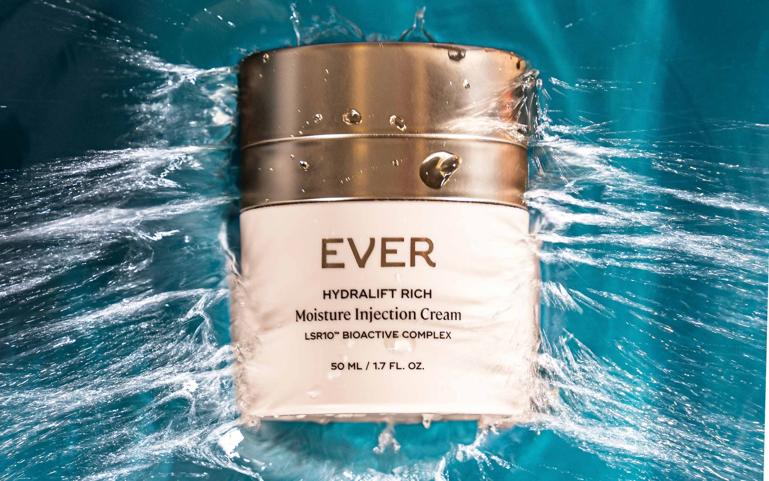
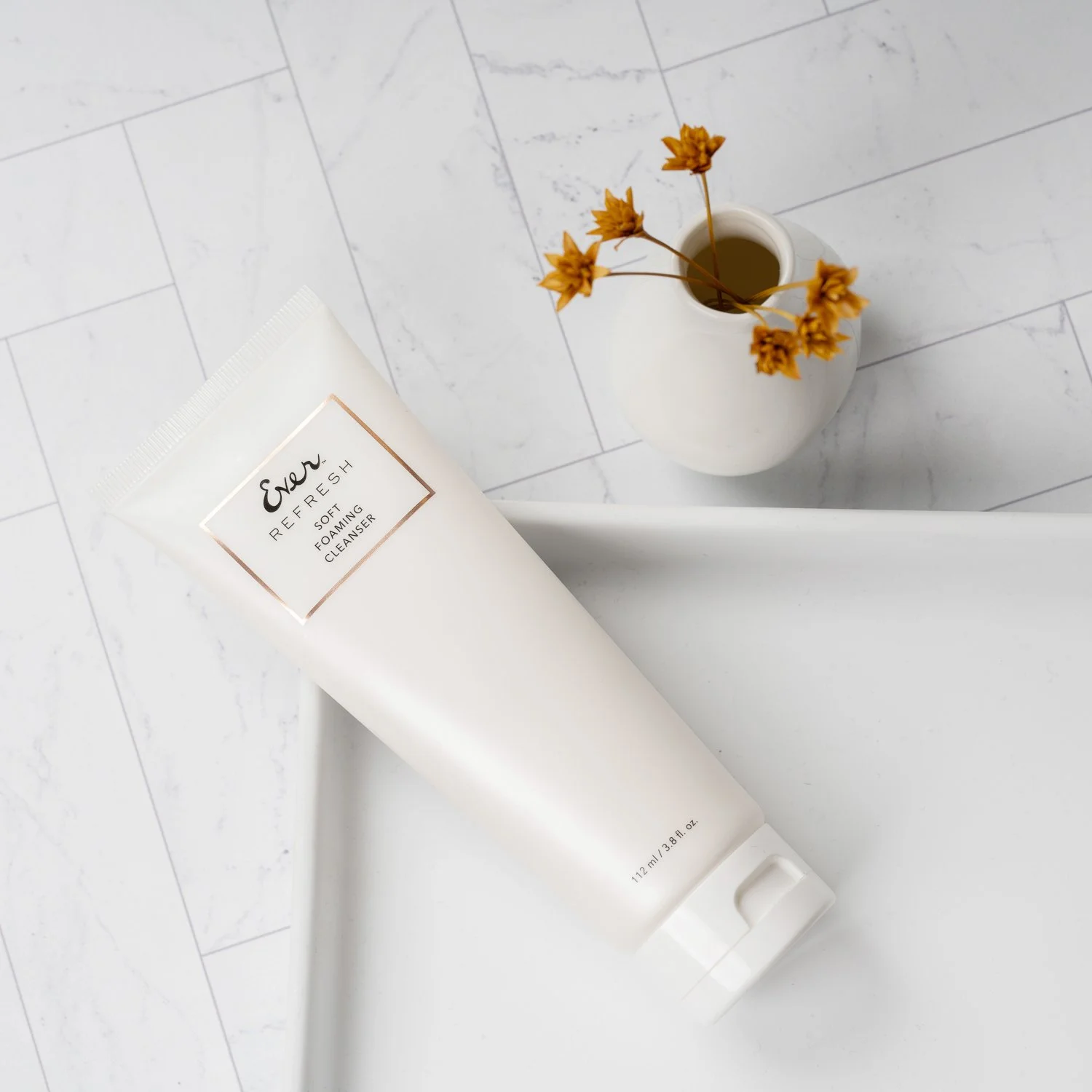
I defined a new visual identity centered on monochromatic imagery that echoed each product’s packaging hue, signaling its treatment stage at a glance. To support ongoing content needs, I also established clean, organic photography standards—featuring bright, natural lighting and simple compositions—for product pages and evergreen assets. This guideline empowers freelancers, agencies, and internal teams to produce on-brand visuals at scale.
The Solution
Client
Ever Skincare
Role
Creative Director, Photographer
Scope
Visual Identity Development, Photography Style Guide
Team
Internal Brand Team, Designer


A dual visual approach ensured that Ever Skincare’s refreshed imagery resonated with both product quality and brand identity.


Impact & Results
The photography framework launched seamlessly across web, social, and print, unifying Ever Skincare’s look and reinforcing its premium, stage-based brand narrative.