Case Study
Tide
I initiated a test project aimed at refreshing the product’s visual presentation. This endeavor focused on highlighting the product’s portability and effectiveness through innovative visual storytelling, incorporating the brand’s iconic colors to create a cohesive and recognizable aesthetic.
Reimagining Tide To-Go’s Creative
Brand
Tide
Role
Creative Director, Photographer
Scope
Concept Development, Photographic Styling & Campaign Visuals
Team
Solo initiative
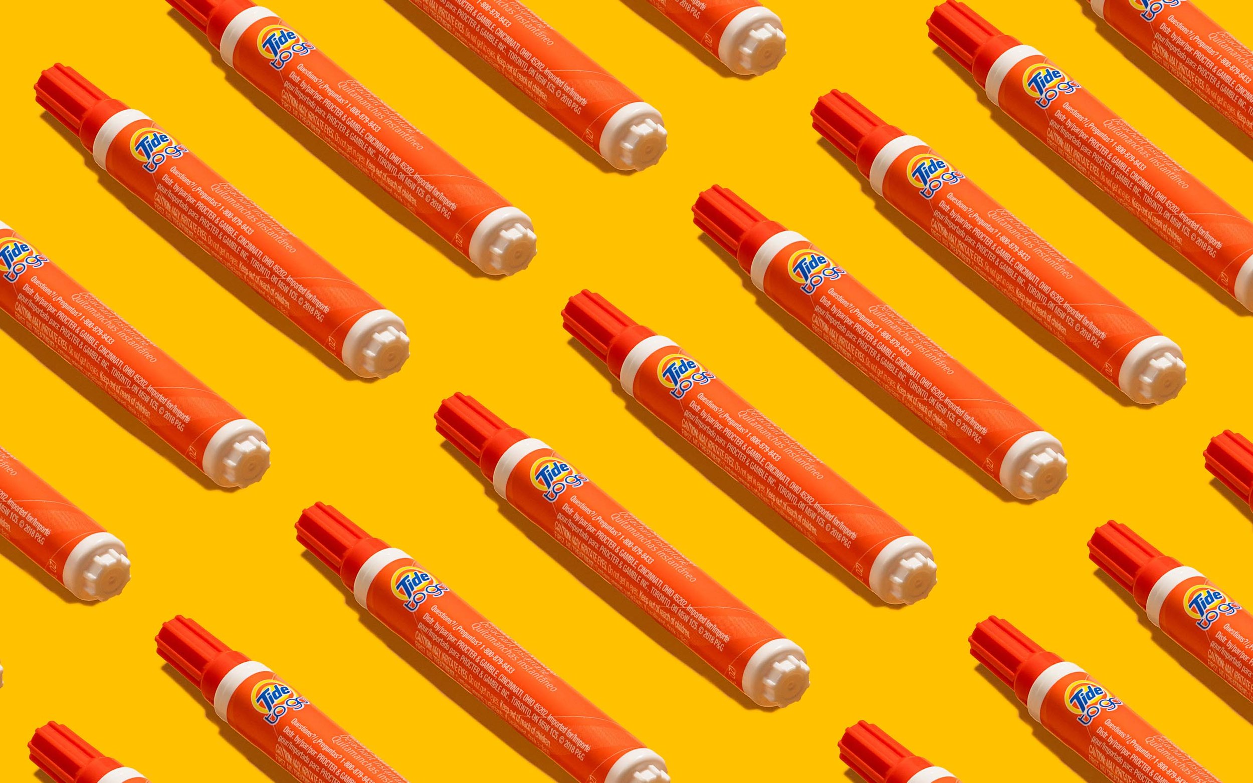
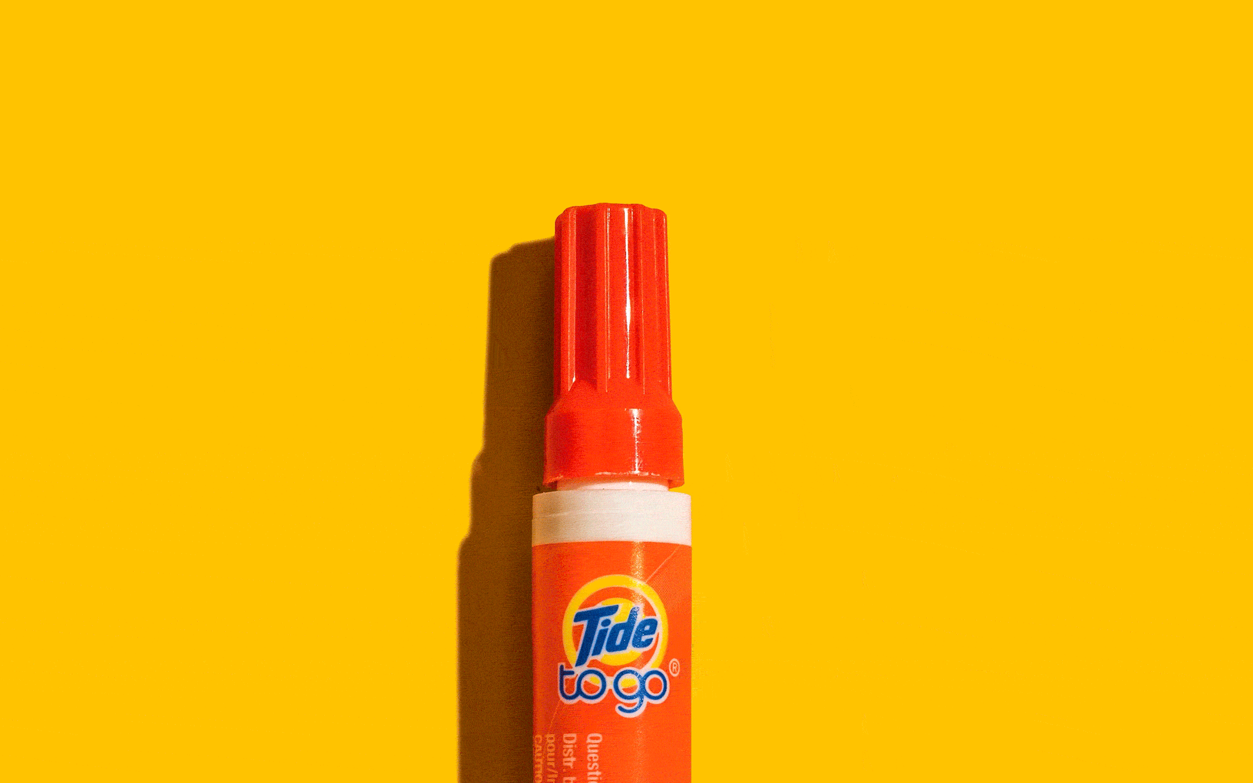
Leveraged the Tide iconic color palette by crafting monochromatic scenes with an animated aesthetic.
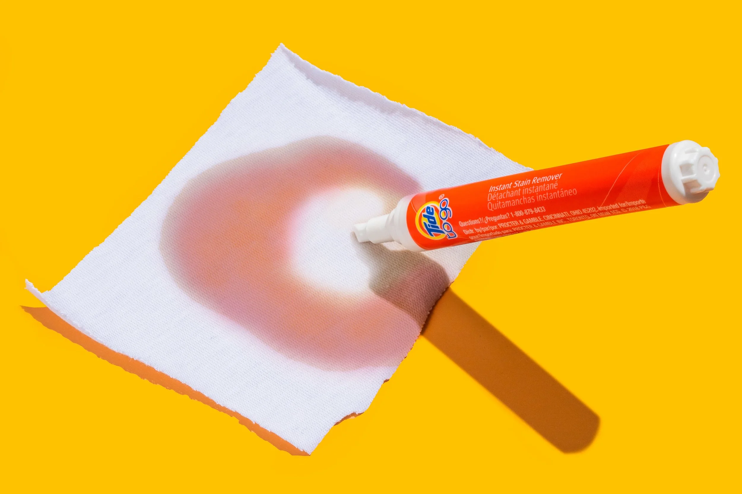
Hyper minimalistic creative ensured the product remained the focal point.
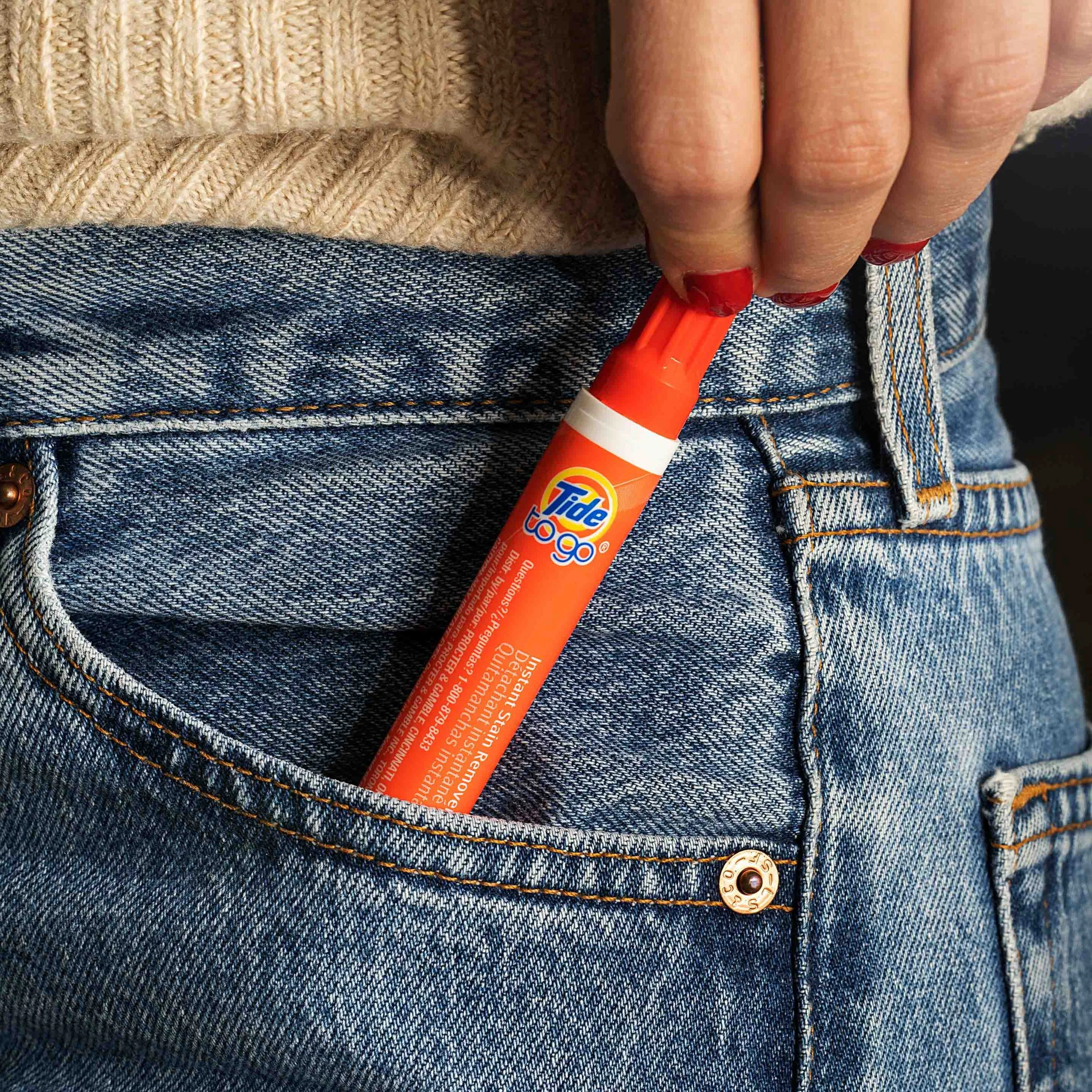
real life scenarios emphasize the pen’s size and convenience, illustrating its seamless integration into daily life for on-the-go stain removal.

Impact & Results
While conceptual, the resulting visuals align seamlessly with Tide’s brand identity, presenting a cohesive body of work that could be effectively utilized across various marketing channels to promote Tide To Go’s practicality and efficiency.